Building a good website on a budget
Every business needs a website. It gives you credibility and represents your business online. In our digital world, that’s necessary if you want to be successful. When building a great website on a budget, you need to start with the right foundation (WordPress), use design best practices, optimize for SEO, and make the site look great while being easy to use.
Keep these tips and ideas in mind as you build a great website on a budget.
Start with WordPress
While drag and drop sites make it easier to design a website—all you have to do is drag the page elements where you want them—most of those services ultimately limit your scalability. They don’t integrate as well with other products and you’re often limited to their add-ons and upgrades, which usually cost money. WordPress, on the other hand, encourages your scalability and provides much more opportunity for customizing and growing, often at low or no cost.
Start by checking out these WordPress themes, all of which are powered by Visual Composer. Visual Composer provides a drag and drop interface for WordPress users. In this way, you get the convenience of drag-and-drop site builders with the customization and scalability of WordPress.
As you’re browsing through themes, note that some of your best options will be paid. While there are free themes, these offer limited opportunities to expand and customize. Many paid themes come with a variety of built-in templates that make it easy to get your site up and running with minimal design or development knowledge. You’ll also have access to a support team, in case you have questions.
Make Use of Plugins
If you’re on a budget, free plugins are your best friend. A plugin is like an app or piece of software that adds certain functionality to your website. For example, a social media plugin allows visitors to share content and images from your site. Most commonly, this is used to encourage sharing on blog posts.
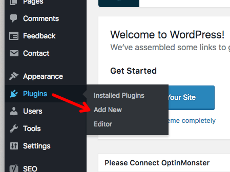
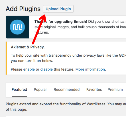
Ultimately, plugins allow you to expand what your site can do without any coding or development knowledge. To add them, simply download the plugin, and upload it to your WordPress site:


Here’s a list of must-have plugins for your website:
Yoast SEO: SEO is critical for people to find you on the web and this plugin helps you do all the most important things: set the title tag and meta description, generate a sitemap, modify how your site looks in search, and much more. Follow the set-up steps within the plugin, or check out this YouTube video, to make sure you’re using the settings correctly.
Smush: This plugin optimizes the size of every image you upload so they don’t slow your website down. The speed of your site is crucial for both SEO and user experience—don’t let large, high-quality images slow you down.
Swifty Bar: This is one of the best free social sharing plugins I’ve ever seen. It’s sleek and includes extra information about your blog post, including read time, title, and category.

Keep it Clean
Giving your website a “clean” look is important for making it feel credible and professional. But what does “clean,” in terms of web design, mean? Shaun Cronin, freelance web designer, explains:
“If there was one word I would use to define ‘clean’ design, it is refinement. Every individual element should look like it belongs and should benefit and complement the design as a whole. The overall design needs to be balanced to allow the information to flow and be easy to consume.”
As you design your website, keep it clean with Cronin’s tips:
- Pixel perfect details: Think about the minor elements, like borders and textures.
- Spacing: Use plenty of white space using wide margins and padding, and let each element stand out on its own.
- Alignment: For example, large bodies of text should be left aligned. Cronin suggests: “Left aligned text produces a solid line and creates easily distinguishable columns of information. Centrally aligned text on the other hand creates an uneven edge on either side and can be difficult to read in large columns. Save the central alignment for short lines of text.”
- Typography: Choose a font that’s easy to read.
- Color: Opt for neutral, white, light colors.
Always Use High Quality Images
Just because you’re on a budget, doesn’t mean your site has to look like it. High quality images make your website look professional, which adds credibility to your brand and business. Luckily, you don’t have to spend a lot of money to get these photos, you just have to know where to look. The best websites for high-quality images include, Unsplash, Pexels and PixaBay.
Make it Easy to Navigate
The success of your website depends, in large part, on the experience visitors have when they land there. According to the web performance experts at Gomez, 88 percent of consumers said they wouldn’t return to a website after a bad site experience. Navigation is an important part of this experience. If it’s hard to find your contact information or services page, visitors will likely head elsewhere, in search of an easier website to work with.
To make navigation easy, use categories and pages, create accurate titles for the pages on your navigation bar, and make sure details like your search bar, works correctly.
Build Your Great Website on a Budget
Keep these tips and tricks in mind as you build a great website on a budget. You don’t need a lot of money to make it look good—just use the resources available and follow best practices. When you’re able to free up some budget for a web designer, hire someone to come in and refine the look and feel. It can even be a freelance designer, hired just for this project. In the end, you’ll have a high-quality website that represents your business effectively and elevates your brand.
Jessica Thiefels has been writing and editing for more than 10 years and spent the last seven years in marketing. She’s now a consultant and offers organic content marketing packages to businesses of all sizes and social media coaching to entrepreneurs who need some guidance to get started. You can find her work on more than 500 websites worldwide, including Virgin, Forbes, Business2Community, Score.org and more. Follow her on Twitter @JThiefels and connect on LinkedIn.
(and create unique links with checkouts)
*While subscribed to Wave’s Pro Plan, get 2.9% + $0 (Visa, Mastercard, Discover) and 3.4% + $0 (Amex) per transaction for the first 10 transactions of each month of your subscription, then 2.9% + $0.60 (Visa, Mastercard, Discover) and 3.4% + $0.60 (Amex) per transaction. Discover processing is only available to US customers. See full terms and conditions for the US and Canada. See Wave’s Terms of Service for more information.
The information and tips shared on this blog are meant to be used as learning and personal development tools as you launch, run and grow your business. While a good place to start, these articles should not take the place of personalized advice from professionals. As our lawyers would say: “All content on Wave’s blog is intended for informational purposes only. It should not be considered legal or financial advice.” Additionally, Wave is the legal copyright holder of all materials on the blog, and others cannot re-use or publish it without our written consent.


